An open letter to President Trump
Dear Mr President
I read in this morning’s (failing) New York Times that you were pretty keen on maps in your briefing papers.
And while Mr. Obama liked policy option papers that were three to six single-spaced pages, council staff members are now being told to keep papers to a single page, with lots of graphics and maps.
“The president likes maps,” one official said.
Now I recognise that this may be a deliberate attempt by the dishonest press to mislead people and that you may not like maps. But, in case you do like maps, I wanted to give you a bit of insight into some of the sneaky things that those very dishonest cartographers (they even have a long foreign name to confuse people) do to make FAKE MAPS.
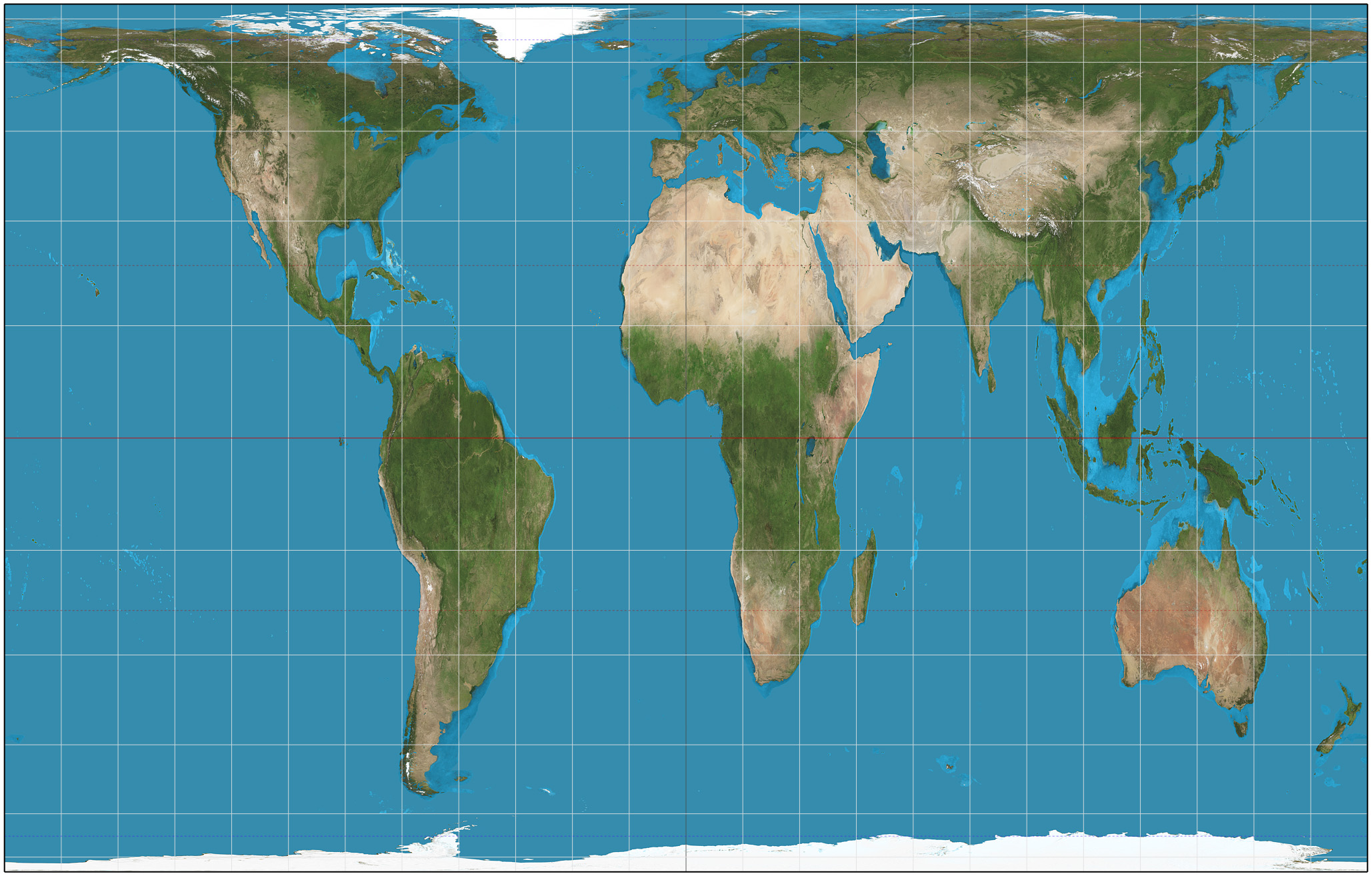
So the first thing FAKE MAP makers can do is to change projection from a wholesome projection like this Web Mercator projection which emphasises the size of your hands the US compared to the southern hemisphere

Compare that with this sneaky Gall-Peters projection which is an “equal-area cylindric or cylindrical equal-area projection. It achieved considerable notoriety in the late 20th century as the centerpiece of a controversy about the political implications of map design.” (Source Wikipedia)
You might prefer a nice US centric projection like this US Centric Map

Or you could suggest that your map makers read Michael Corey’s guide to map projections for the US

So enough about projections, they are pretty technical and can be confusing even for experts.
Once you have chosen your projection (I wonder how long it will be before a loyal map maker comes up with a Trump projection?) then maps are a good way of presenting a lot of information and enabling you to get a clear view of the subject matter on which you are being briefed. Except that sometimes they aren’t! Before you make any major decisions (think immigration bans, voter registration changes, healthcare, starting a war etc) you might want to read How to Lie with Maps by Mark Monmomier – yes someone has written a whole book about FAKE MAPS, very very dishonest cartographers.

If you are feeling bored on one of those lonely nights in the White House you could also try playing the Redistricting Game which will give you a clue to how someone could win an election without winning the majority of the votes (the answer is more to do with Governor Elbridge Gerry than illegal immigrants). I loved this quote on the home page (even if it did come from a failed, loser, Democrat)
“The polarization and poisonous atmosphere that have infected the House of Representatives for the past two decades or more can be traced — in large part — to the manner in which district lines are drawn in most states.”
I would also be remiss not to advise you to normalise your choropleths, no that is not some obscene abuse it’s advice from my friend Ken Field that you can read here, here, here and here.
So by now you may be wondering whether getting your daily briefings in the form of a map is such a great idea? Well on the plus side lots of people have been making maps that you might not have seen so I thought I would share a few of the best with you.


There are a lot of FAKE MAPS out there from those failing very very dishonest cartographers, keep them coming.


One thought on “FAKE MAPS, very dishonest!!!”